Every kind of slider that Noyan Content Slider and its Pro add-on can make, each one live on this page and built with the Noyan Home furniture pictures. Jump to a section with the links below, then hover, drag, click and scroll to try them. Sections marked needs an internet connection play films or read feeds from other sites.
- Opening hero
- Slider types
- Effects
- Playback & navigation
- Captions & fonts
- Where the words sit
- Hero layouts
- Pro widgets
- Scheduled slides
- Dynamic content
- Pro add-ons
- Scroll story
- Templates
A hero to open with
The Section / hero type shows one wide slide at a time, with words and a button over a photograph: the banner a shop puts at the top of its home page.
Three rooms, one banner
Three room photographs, each with a short headline, a line of text and a button to its part of the shop. The photo drifts slowly (kenburns), the bar under the photo fills up until the next slide (progress), and the dining slide stays up for 8 seconds instead of 6 (hold). Hover to pause, or drag, swipe or use the arrows.

Rooms made for staying in
Deep Harbour sofas, bouclé lounge chairs and a fluted coffee table, built to be used every evening.
Shop the living room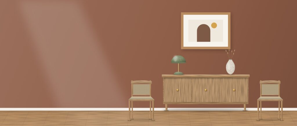
Pull up a Linden chair
Linden dining chairs and the fluted Fjord sideboard, ready for long dinners.
Shop dining
Slow mornings start with the Nest bed
The Nest upholstered queen bed, soft to lean on.
Shop bedroomThe seven slider types
Every slider starts as one of seven types, and the hero at the top of this page is the first. Here are the other six, with Video shown twice (plain, then with words over the film). The first five come with the free plugin; the last, Dynamic, needs Pro and fills itself from the shop.
Image gallery: one piece at a time
Square product photos shown one at a time, with the name over the picture and a strip of thumbnails underneath. Click a thumbnail to jump to it, or click the big picture to open it full size (lightbox); in there, the arrow keys move and Esc closes.
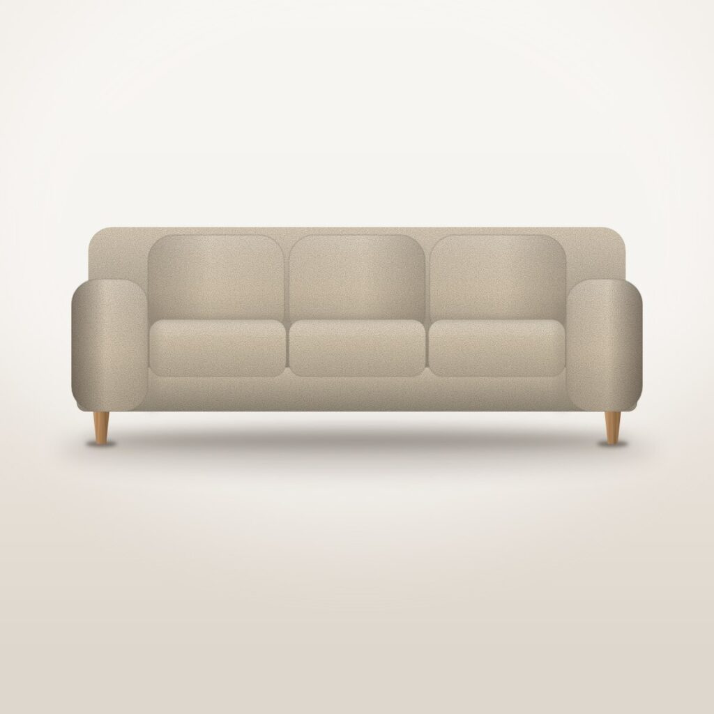
Harbour Three-Seat Sofa
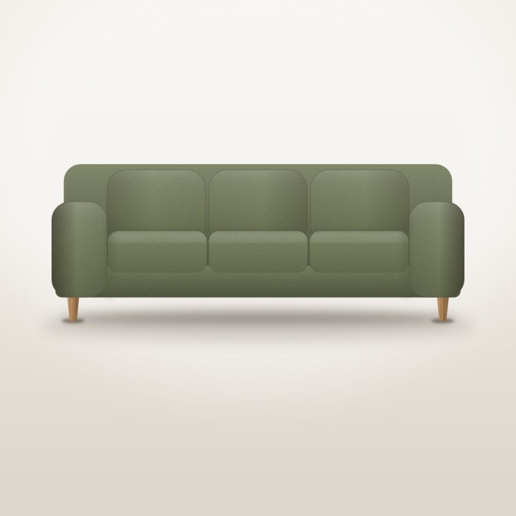
Harbour Three-Seat Sofa

Harbour Three-Seat Sofa

Otto Bouclé Lounge Chair
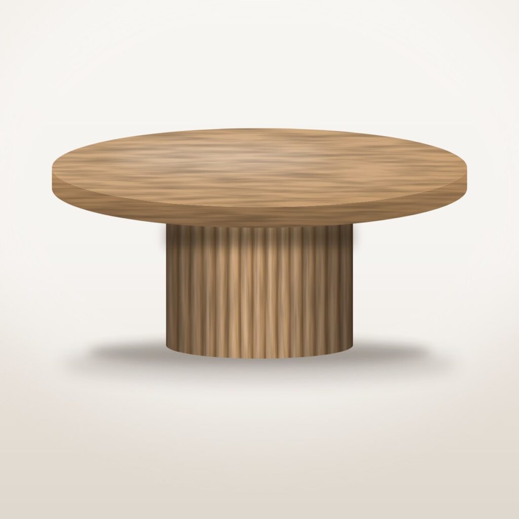
Ridge Fluted Coffee Table
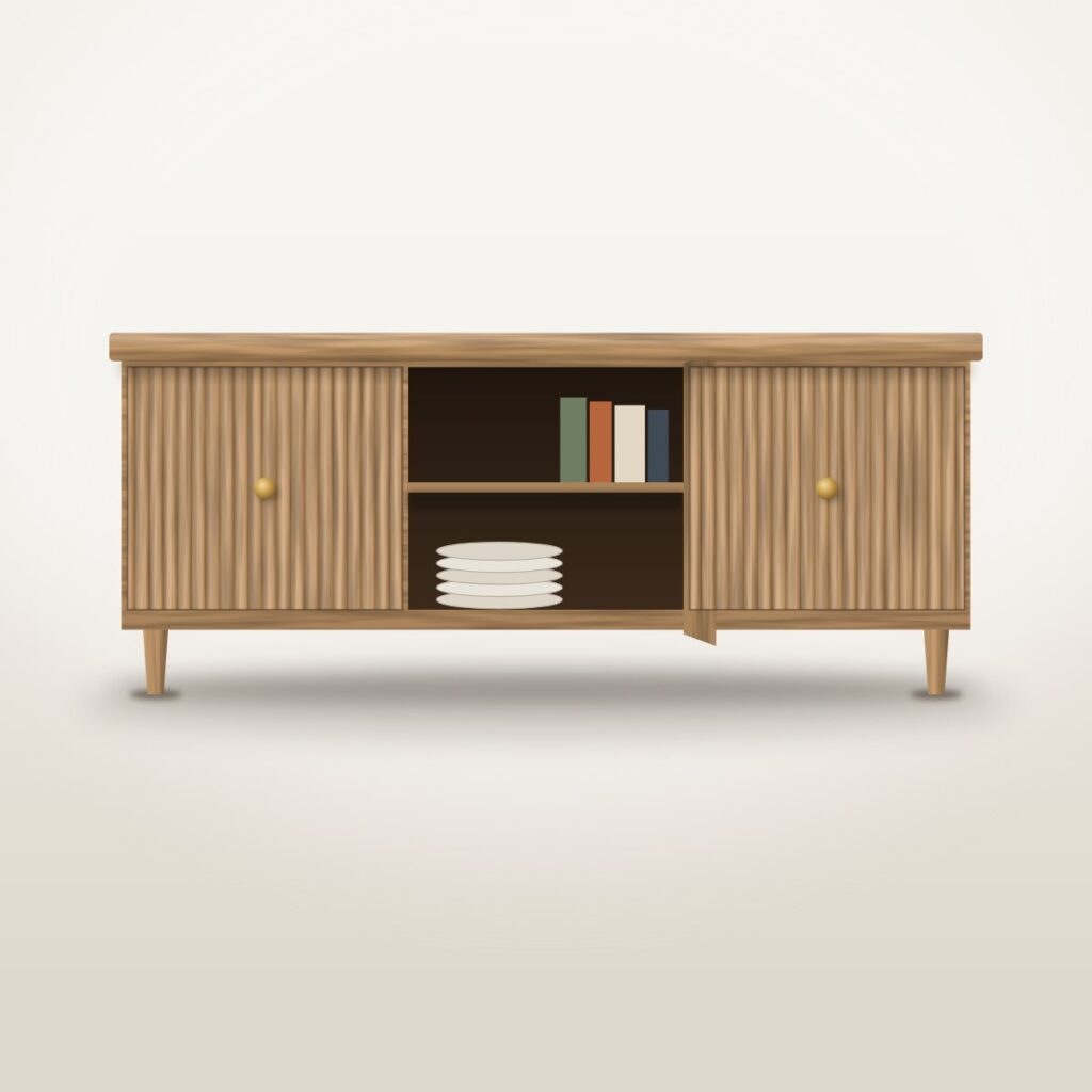
Fjord Fluted Sideboard
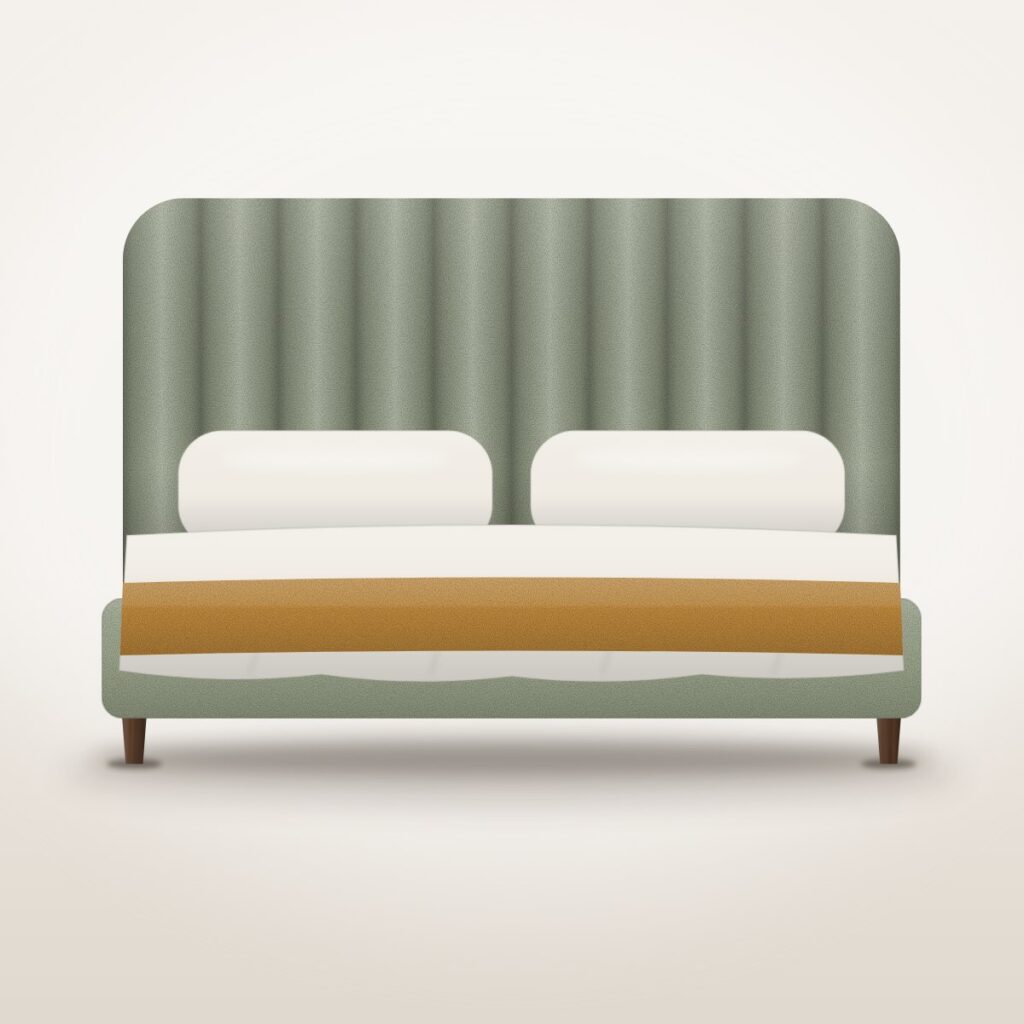
Nest Upholstered Bed, Queen
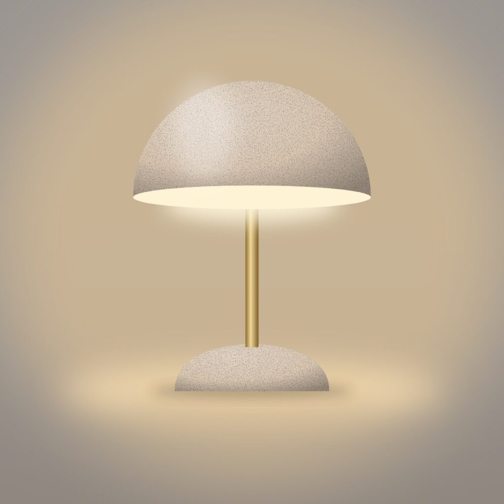
Dome Table Lamp
Content carousel: product cards
Three cards across (two on a tablet, one on a phone), each one a link to its product page. The row moves on by itself every five seconds; rest your pointer on it to pause, or use the arrows or the dots, or drag it. The names and prices on these cards were typed into the slider by hand, while the Dynamic slider at the end of this section reads them from the shop.
Video: YouTube, Vimeo and an MP4 file
One film at a time, each with its own caption and button underneath: a YouTube film, a Vimeo film and an MP4 file played by the browser. Only the MP4 shows a picture from the media library (the bedroom photo) before you press play. Nothing plays on its own and the slider does not move by itself; the thumbnails jump between the films. The films are Blender Foundation and TSO Photography shorts used as stand-in footage (needs an internet connection).
Video with words over the film
The same Video type with layers: a headline, a line of text and a button placed on top of the film instead of below it, and the button still works while the film plays. The film is a short stock clip of a flower used as stand-in footage; it starts muted and loops (video_autoplay) unless your device asks for less motion, and until it loads you see the living-room photo (the film needs an internet connection).
Reels & Shorts: a row of vertical films
Vertical films in a row, four across on a desktop (two on a tablet, one on a phone), each with a Shop button in its top corner. There are six, so on a desktop use the arrows or drag the row to reach the last two. The films are Blender and NASA YouTube Shorts used as stand-in footage, and every Shop button simply goes to the shop. Nothing plays until you press play (needs an internet connection).
Elementor designs as slides
Each slide is a design saved in Elementor (a room photo, a heading, a line of text and a button) and picked in the slider. Elementor draws what is inside each slide; the slider adds the crossfade, the arrows, the dots and the autoplay. This type needs the free Elementor plugin.
Dynamic (Pro): straight from the shop
Nothing on these cards was typed in: the slider asks the shop for its furniture and decor, so the names, prices, the Sale badge on the Ridge coffee table and the Add to cart buttons are live and change when the shop does. Add to cart really puts the piece in your basket; the Harbour sofa and the Otto chair come in several colours, so their buttons say Select options and open the product page.
Harbour Three-Seat Sofa

Otto Bouclé Lounge Chair
SaleRidge Fluted Coffee Table
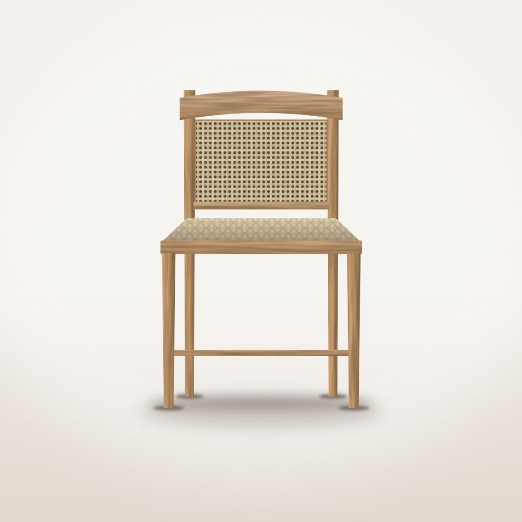
Linden Dining Chair
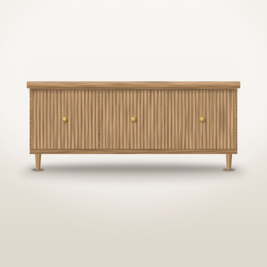
Fjord Fluted Sideboard
Nest Upholstered Bed, Queen
Bouclé Scatter Cushion
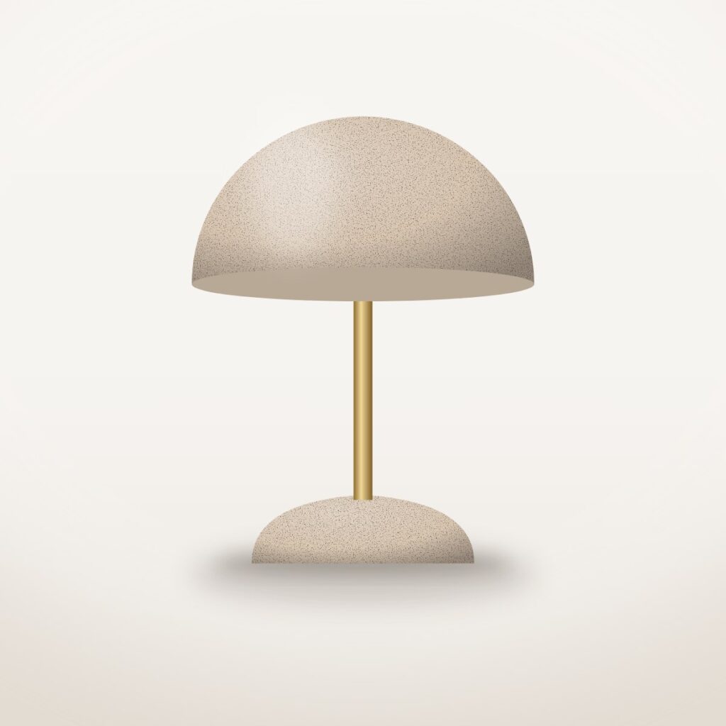
Dome Table Lamp
 Only 2 left
Braided Jute Rug, Round

Speckled Stoneware Vase
Ten transition effects
Each slider below uses one of the ten transition effects, chosen with a single setting: the first six move a row of slides, and the last four stack the slides in one place and always show one at a time. They play by themselves every few seconds and pause while your pointer rests on them; if your device is set to reduce motion they stay still until you use the arrows, and every change is instant.
Smooth slide
The classic effect: two rooms side by side (one on smaller screens), and every few seconds the row glides along by one and eases to a stop. Drag it sideways or use the arrows to move it yourself.
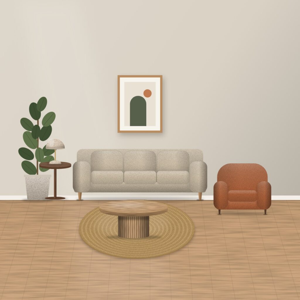
Harbour sofa
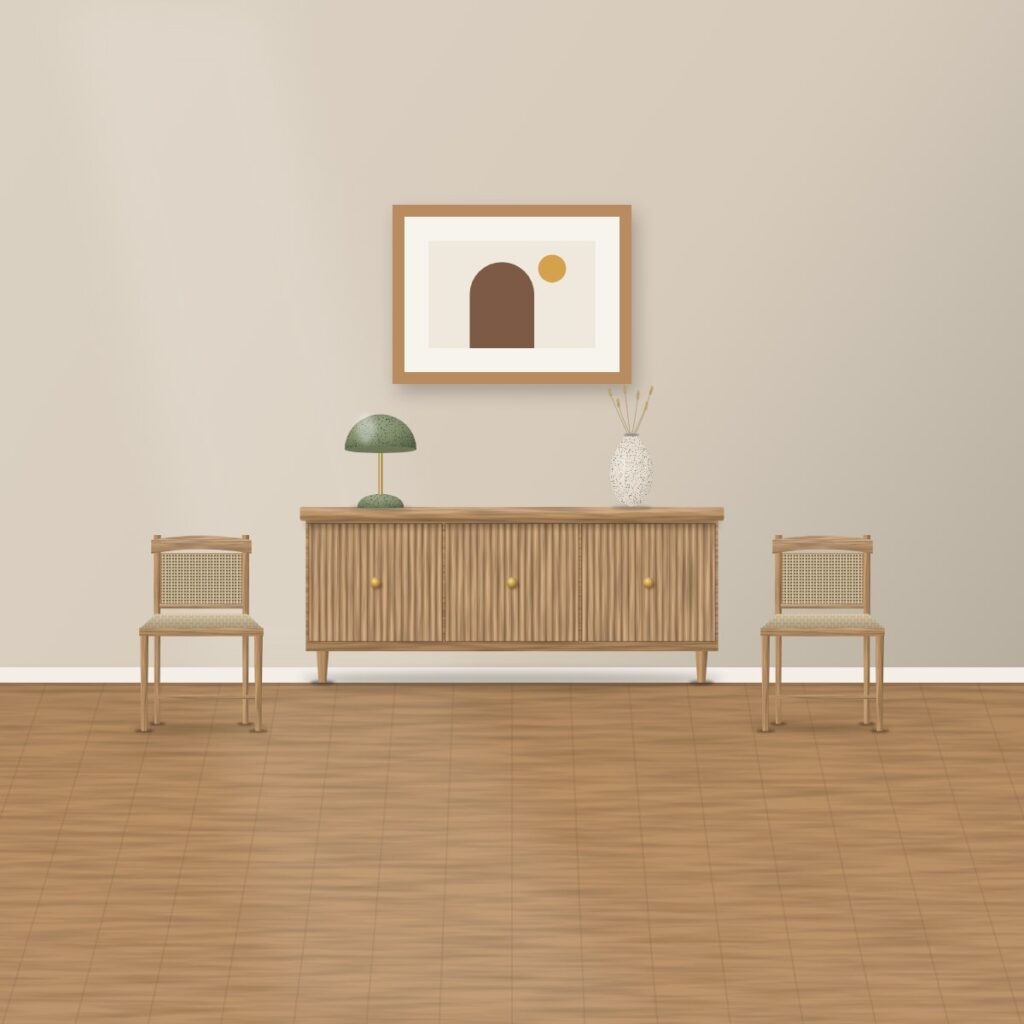
Linden dining chairs
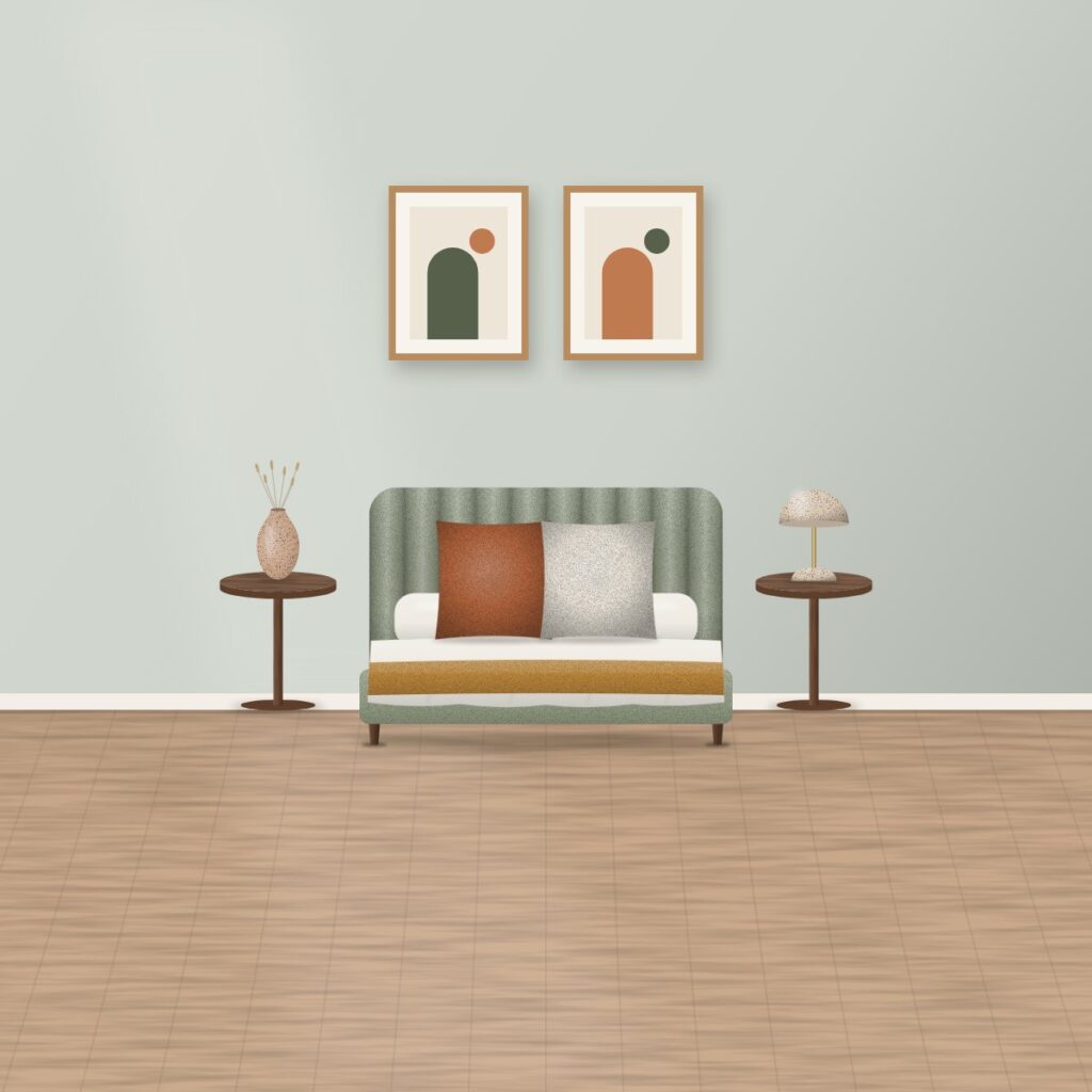
Nest bed

Otto lounge chair
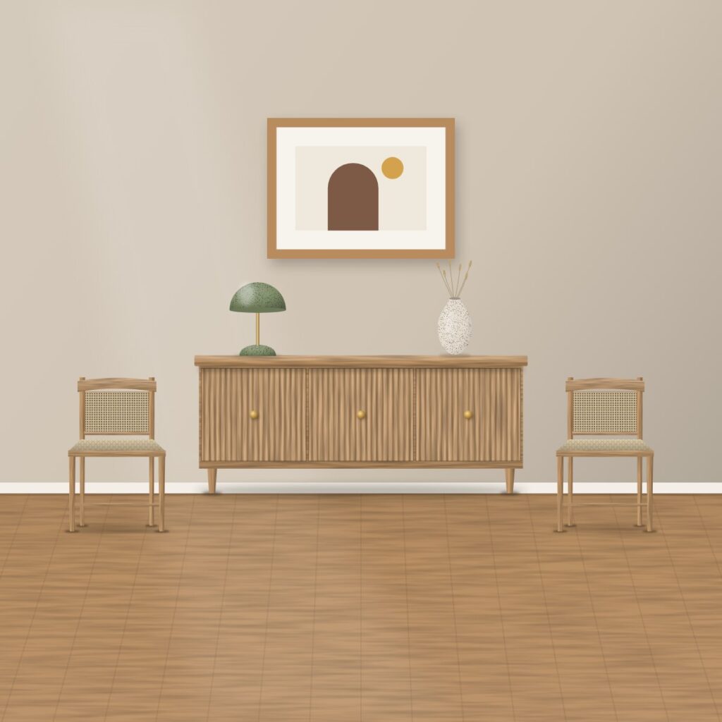
Fjord sideboard

Ridge coffee table
Fade and rise
The row still slides, but the piece on its way out dims and drops a little while the one arriving brightens and rises into place. Watch the edges as the row moves.
Linden dining chair
Dome table lamp
Stoneware vase
Bouclé cushion
Braided jute rug

Ridge coffee table
Zoom reveal
Each close-up arrives slightly enlarged and settles back to its true size as it slides into view. The hover zoom (hover_effect) is off here, because this effect already controls the picture’s size.
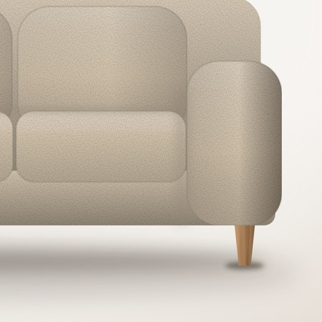
Woven oat fabric

Looped wool bouclé

Hand-cut flutes

Cane and paper cord

Brass knob

Channel tufting
3D coverflow
Pieces arrive turned slightly away and a little smaller, then swing flat and full size as they settle. At rest every picture is flat, so watch while the row is moving.
Harbour sofa
Otto lounge chair
Fjord sideboard

Nest bed
Ridge coffee table
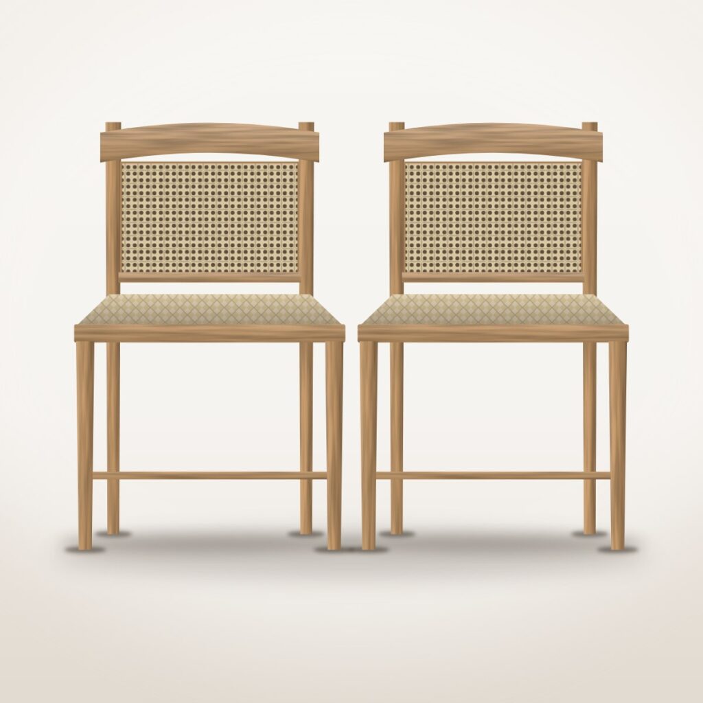
Linden dining chairs
Cinematic drift
A hero slider: each room photograph comes in slightly enlarged and drifts back into place, like a slow camera push, and the headline and button rise in after it. The drift lasts 1.3 times the slider’s duration; each button opens that room’s shop category.
Slow evenings
Gather round
Rest, properly
Parallax
While one room slides out and the next slides in, each picture shifts inside its frame as the slides move, which gives the rooms a sense of depth. Click an arrow and watch the picture move within its frame.
Otto lounge chair
Linden dining chairs
Ridge coffee table
Nest bed
Fjord sideboard
Crossfade
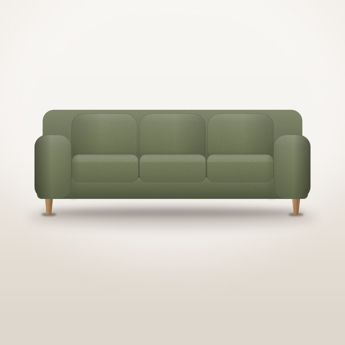
Nothing moves sideways: each colourway fades into the next in the same spot, from the Harbour sofa in oat, olive and slate to the Otto chair in ivory, rust and moss.
Harbour sofa
Harbour sofa
Harbour sofa
Otto lounge chair
Otto lounge chair

Otto lounge chair
3D cube
Each piece turns away on one face of a cube as the next face swings round into view. Swipe it or use the arrows to turn it yourself.
Dome table lamp
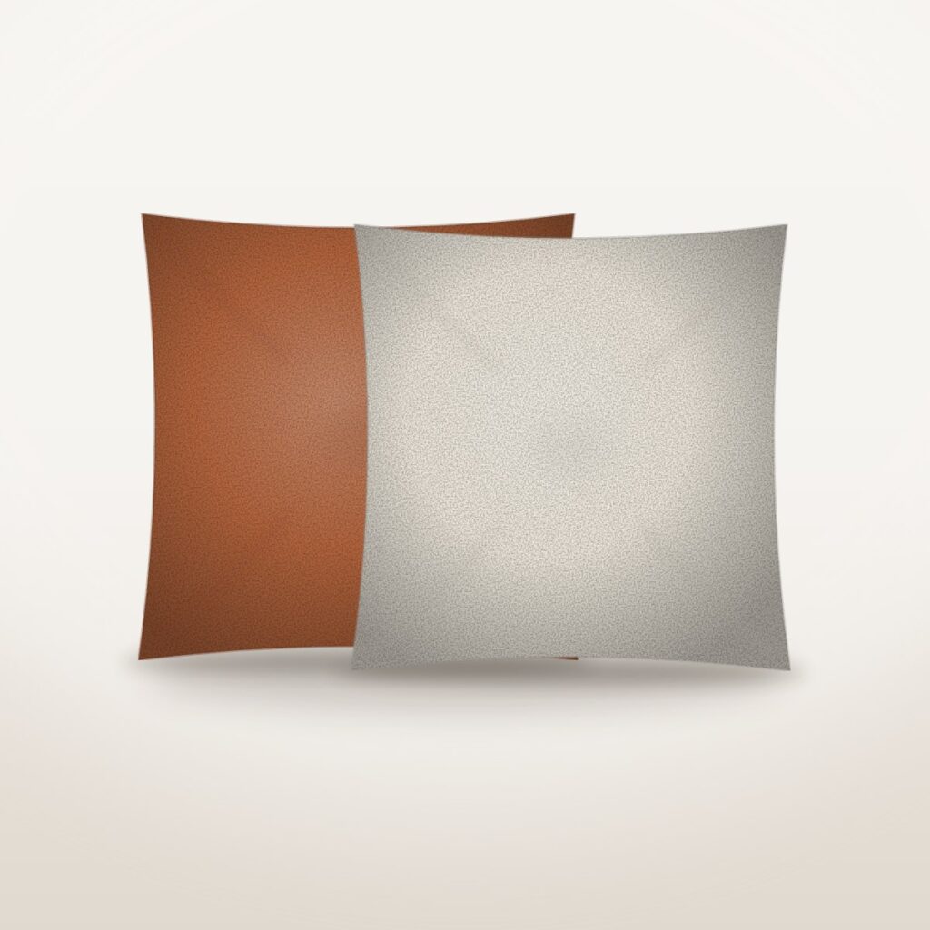
Bouclé cushions
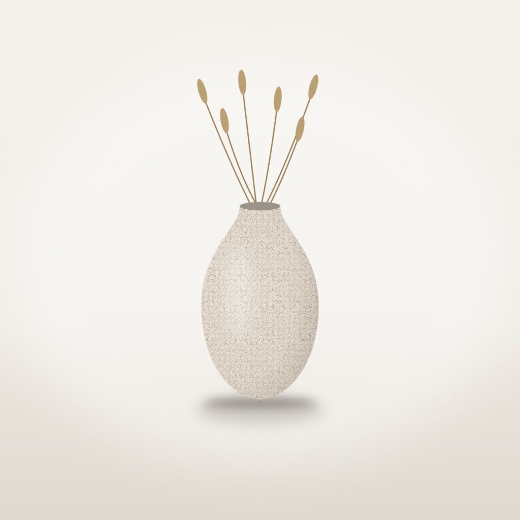
Stoneware vase

Braided jute rug

The finishing touches
Flip
Each card turns over like a page: a piece of furniture, then its measurements on the back, then the next piece.
Ridge coffee table

Ridge coffee table
Fjord sideboard

Fjord sideboard
Nest bed

Nest bed
Stacked cards
The top card is dealt away to the left with a slight tilt, and the next room grows into its place from underneath.
Harbour sofa
Linden dining chairs
Otto lounge chair
Nest bed
Fjord sideboard
Playback and navigation
How a slider plays by itself and how visitors move it: timing, arrows, dots, thumbnails, the lightbox and more. Click or Tab into any slider and the left and right arrow keys move it (up and down on the vertical one); if your device is set to reduce motion, nothing here moves on its own.
Progress bar, and one slide that stays longer
A bar beneath the slide fills as each room counts down, and the dining room is set to stay for 8 seconds instead of 4 (progress and the slide’s own hold). Hover over the slider to pause it: the bar waits where it stopped.
Harbour sofa
Linden chairs
Nest bed
Progress in the active dot
Here the countdown lives in the dots: the long, active dot fills while each picture plays, then the next dot takes over (progress set to dot). This one keeps playing under the mouse pointer, because pause_hover is off.
Nest upholstered bed
The upholstered frame
Channel-tufted headboard
Queen size
Ken Burns hero
Each room photograph slowly zooms and drifts while it is on screen, then crossfades into the next room every 7 seconds (kenburns). The buttons open the real shop categories.
Made for slow evenings
Sofas, lounge chairs and a coffee table for the room you live in.
Shop the living roomAutoplay and a lightbox
Three decor pieces at a time move on by themselves; rest your pointer on the row to pause it (pause_hover). Click any picture to open it full size in a lightbox (lightbox).
Bouclé scatter cushion
Bouclé cushions, a pair
Dome table lamp
Dome table lamp, lit
Braided jute rug
Speckled stoneware vase
Stoneware vase, styled
The finishing touches
Four, two or one across, moving two at a time
Four pieces show on a desktop, two on a tablet and one on a phone, and each arrow press moves two (slides_to_scroll), so the dots count pages rather than pieces. Loop is off, so it stops at each end; on a phone the arrows still jump two, so swipe to see every piece.
Harbour sofa
Otto lounge chair
Ridge coffee table
Linden dining chairs
Fjord sideboard
Nest bed
Dome table lamp
Braided jute rug
Filled arrows over the sides
Round, filled arrows sit over the left and right edges of the pictures, with no dots underneath (arrow_position sides, arrow_style filled). Click them, or drag the row with your mouse or finger.
Ivory
Rust
Moss
Looped wool bouclé
In the living room
Square arrows above, bars for dots
The square arrow buttons move above the slider to the top right, and the dots become short bars, with the longest one marking where you are (arrow_style square, dot_style bars).
Linden dining chair
A pair
Cane back
In the dining room

Dimensions
Minimal arrows, centred
Plain arrows without a circle, centred under the dots (arrow_position bottom-center, arrow_style minimal). Two rooms show at a time (one on a phone), and it moves on every 4 seconds.
Ridge coffee table
Fjord sideboard
Otto lounge chair
Linden chairs
Nest bed
Thumbnail strip
One view of the Fjord sideboard at a time, with a strip of small pictures underneath: click a thumbnail to jump straight to that view, and the highlight follows along when you use the arrows (thumbnails).
Fjord fluted sideboard
Fjord fluted sideboard
Solid brass knob
Fjord fluted sideboard
Fjord fluted sideboard
Lightbox and full screen
Click any close-up to open the full-size photograph, step through with its arrows, a swipe or the arrow keys, and press Esc to close (lightbox). The four-corners button beside the arrows puts the whole slider on full screen (fullscreen); iPhones do not allow this, so there it does nothing.
Woven performance fabric
Looped wool bouclé
Hand-cut flutes
Natural cane back

Wool bouclé front
Hand-braided jute
Vertical slider
The Harbour sofa’s colours travel up and down instead of sideways: the arrows turn to point up and down, you can drag it vertically, and once the slider has focus the up and down arrow keys move it (direction vertical).
Harbour sofa
Harbour sofa
Harbour sofa
Woven performance fabric
Auto height
Wide room banners and square pictures take turns, and the slider grows and shrinks to fit each one instead of cropping them to one shape (height_mode auto). The captions sit over the pictures.
Living room
Harbour sofa
Dining room
Linden chairs
Bedroom
Nest bed
Captions, fonts and sizing
Captions can sit under each picture or over it, in your own colour, size and alignment, with a hover effect and a shadow. A slider can also use its own fonts and keep to a set width.
Captions over the picture
Each piece’s name, with its room above it, sits over the bottom of its photograph, centred on a soft dark fade (caption_position overlay). Hover a card and its picture zooms in gently (hover_effect zoom); drag or use the arrows to see all six, and click one to open that piece in the shop.
Captions below the picture
Decor pieces with their names underneath, set to the right in a custom brown (caption_color), on square pictures with a strong shadow. Point at a card with a mouse and it tilts in 3D (hover_effect tilt, which phones skip); click one to open it in the shop.
Typefaces from Google Fonts
Caption titles in Playfair Display and the small labels in Inter, loaded from Google Fonts with font_heading, font_body and font_source (needs an internet connection). Offline, the browser uses its own system fonts instead: Georgia or a similar serif for the titles and a plain sans-serif for the labels.
Width, spacing and whole pictures
This slider is held to 80% of the column it sits in (max_width in percent) and centred on a sand-coloured band with 48px of space above and below (padding_y). With image_fit contain, each square packshot is shown whole inside a wide frame, with plain bars at the sides instead of being cropped.
Where the words sit
A hero’s words can sit in any of nine places, chosen once for the whole slider with content_position. Each hero below has two slides: use the arrows or swipe, and the second slide keeps the same spot.
Top left
The words sit in the top-left corner. Both photos are lined up by their left edge (image_position left center), so plain wall stays behind the words.
Stay late
Drift off
Top centre
The words are centred along the top of the slide, and may use up to 80% of its width (content_width).
Dine late
Lights out
Top right
The words sit in the top-right corner, set right-aligned, over the plain wall of two room photos. The shade behind a hero’s words always runs from dark on the left to light on the right, so the right-hand heroes use a stronger overlay_opacity.
Lie back
Stay in
Middle left
Halfway down on the left: the position every new hero starts with.
Sleep in
Eat well
Centre
Centred both ways, the classic banner layout.
Dine in
Rest easy
Middle right
Halfway down on the right, set right-aligned. These photos are lined up by their right edge (image_position right center), which brings the furniture into view.
Sit back
Doze off
Bottom left
The words sit low in the left-hand corner, on the plain wall just above the floor.
Pull up
Curl up
Bottom centre
The words are centred along the bottom edge of the slide.
Lie in
Dig in
Bottom right
The words sit low in the right-hand corner, set right-aligned. These are the same two room photos as top right, shown from their top (image_position center top): on a wide screen that leaves plain wall behind the words; on a phone the square photo is barely cropped, so the armchair shows behind them.
Stay put
Sink in
Hero layouts: words, layers and sections
A hero shows one wide slide at a time, and each slide can carry its words in three ways: a simple headline block, layers placed anywhere on the picture, or sections of columns that rearrange themselves on smaller screens.
Designed backgrounds
Three slides with no photographs at all: each background is a two-colour gradient (bg_from, bg_to) behind centred text, and the slides turn on a 3D cube every five seconds while a progress bar fills towards the next turn. Hover to pause, or use the square arrows.
Free-canvas layers
A headline, a line of text, a button and a product picture are placed freely over the room photograph, and each arrives in its own way (fade, rise, sharpen, slide in, zoom) a beat after the one before; the two slides crossfade. The olive sofa card is left out on phones and tablets, and the short line under the headline on phones.
NEW SEASON, LIVING
Sink into the Harbour sofa
Made for slow mornings
The Nest upholstered bed, in queen size.
Stacked sections
Each slide is built from sections and columns instead of being placed freely, so it rearranges itself: narrow the window and the two columns stack, with the sofa picture moving to the top (reverse). The last slide stacks a headline row above three icon columns over a photograph, and the ticked list on the first slide is left out on phones.
More building blocks
Slide 1 has a numbered list, an empty spacer above the button, and a white card whose van icon links to the delivery page (the button opens it in a new tab); slide 2 plays a short film in its own column (stand-in footage of a flower, not our furniture; it needs an internet connection and has no poster picture, so the box stays dark until the film loads); slide 3 is a rounded panel whose boxes sit one above the other, over a picture row that never stacks, even on a phone. Narrow the window to watch the columns give up their row at different widths, the bullet list on slide 2 disappear on tablets, and a swipe tip appear on phones and tablets.
Pro widgets inside a hero
With Pro, a hero slide built from sections can also hold a before-and-after divider, a countdown clock and a Lottie animation, and any piece on it can follow its own keyframe animation.
Before and after
Drag the divider (or tab to it and use the arrow keys) to compare the Harbour sofa in oat and olive, the Ridge table bare and styled, and the Fjord sideboard closed and open. The slides flip over when you use the arrows, and nothing moves on its own while you compare.
Countdown
Three countdown clocks that tick live in your browser: one in days, hours, minutes and seconds, one in days, hours and minutes only (units), and one whose date has already passed, so it shows its “offer has ended” message instead. The Ridge table price is real, but the end dates are examples, set when this page was built; use the arrows to move between them.
Lottie animation
The spinning shape is a small Lottie animation file served from this site: on a wide screen the large one plays when its slide appears and the small one plays at double speed while you hover it (mode), and on the second slide one loops all the time at half speed. If your device is set to reduce motion, they stay still.
Keyframe timelines
Every line on these slides follows its own keyframe path (fly in, rise, bounce, spin, pulse, drift) and plays again each time its slide comes round, while the slider turns on a 3D cube every seven seconds. Hover to pause; with reduced motion switched on, everything simply appears in place.
Scheduled slides (Pro)
With Pro, any slide can be given a date to appear and a date to disappear; outside those dates it is left out for every visitor, and the slider closes up around it.
Only what is on now
Five slides are saved in this slider, but only three show: the Harbour sofa and the Fjord sideboard have no dates, and the Otto chair is inside its dates, while the Nest bed (from 29 Nov) and the Linden chair (ended 10 Sep) are left out (nssp_start, nssp_end). On a phone the three come one at a time: swipe.
Dynamic content (Pro)
Dynamic sliders fill themselves from the shop, the blog, a feed or the visitor’s own basket, so nobody has to edit slides to keep them current. Everything in this section is built live when the page loads.
Filter by room
Pick a room in the chips above the row and the products reload in place, straight from the shop (chips). Prices and Add to cart buttons are live; the sofa and the lounge chair come in several colours, so their buttons say Select options and open the product page.
Harbour Three-Seat Sofa
Otto Bouclé Lounge Chair
SaleRidge Fluted Coffee Table
Linden Dining Chair
Fjord Fluted Sideboard
Nest Upholstered Bed, Queen
Bouclé Scatter Cushion
Dome Table Lamp
Only 2 leftBraided Jute Rug, Round
Speckled Stoneware Vase
Shop by room
Each card is one of the shop’s categories with its own picture and item count, and clicking it opens that room. There are four cards at three per view, so drag or use the arrows to bring in the fourth (term:product_cat).
Rooms as a hero
The same four categories as full-width slides, each with the category’s own description and a button that opens that room. The eyebrow and the button are written once as templates, Room {index} of {total} and Shop {title}, and filled in for every slide.
From the journal
The site’s newest blog posts that have a picture, each labelled with its category and date by the template {terms:category} · {date:j M Y}. Click a card to read the post; these are the site’s sample travel and design articles, not furniture stories.
How to choose a sofa you will still love in ten years
The case for a round coffee table
Dining chairs: why paper cord lasts
Five ways to style a sideboard
A calmer bedroom in a weekend
Bouclé, explained
Sale and stock badges
A Sale flash on the Ridge table and an “Only 2 left” warning on the jute rug, both read live from the shop’s own prices and stock (wc_show_badge, wc_show_stock). Change a price or a stock level in WooCommerce and the badge follows.
WordPress news
The six newest posts from the WordPress.org News RSS feed, with their pictures and dates, read again every hour; each card opens the article on wordpress.org (needs an internet connection). A post without a picture borrows one of the shop’s photos (fallback_image).
WordPress 7.1.2 Release

WordPress Takes Its Turn Leading the Open Website Alliance
WordPress 7.1.1 Maintenance and Security Release

Students Built 108 Websites in Two Weeks in Bangladesh
WordPress Signs the Open Weights and American AI Leadership Letter

AI Creates Opportunity While Artists Ship at WordCamp US 2026
YouTube channel
The four newest videos from WordPress’s own YouTube channel, found from the channel name alone with no API key, and playable right in the slider; use the arrows to move between them (needs an internet connection). The films are WordPress’s, not Noyan Home’s.
Goes with your basket
Suggestions built from your own basket: the shop’s cross-sells for what you have chosen, topped up with related pieces (cart:crosssell). Add a furniture piece to your basket, then reload this page; while the basket is empty this space stays blank.
Pro add-ons
Two Pro add-ons work outside the slider list: a gallery that replaces WooCommerce’s own on product pages, and a row of finishing touches on the cart and checkout. Each can be switched on or off under Add-ons.
Product-page gallery
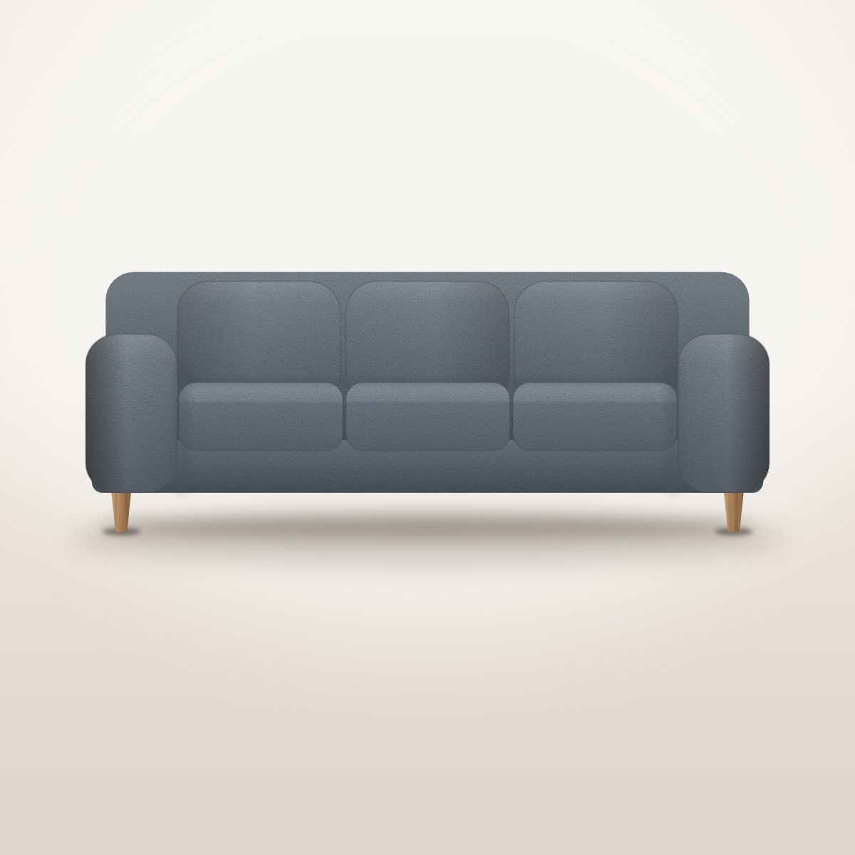
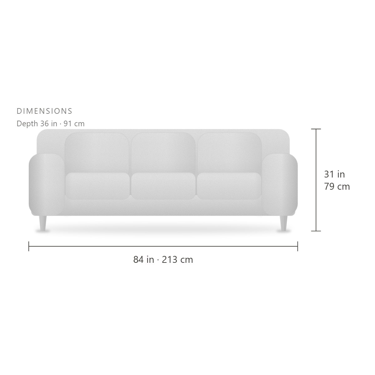
The Harbour sofa’s own product gallery, placed here with a shortcode: swipe or use the arrows, pick a thumbnail, or click the picture to see it full size. On the real product page, Harbour Three-Seat Sofa, it also switches to the colour you pick (Oat, Olive or Slate).
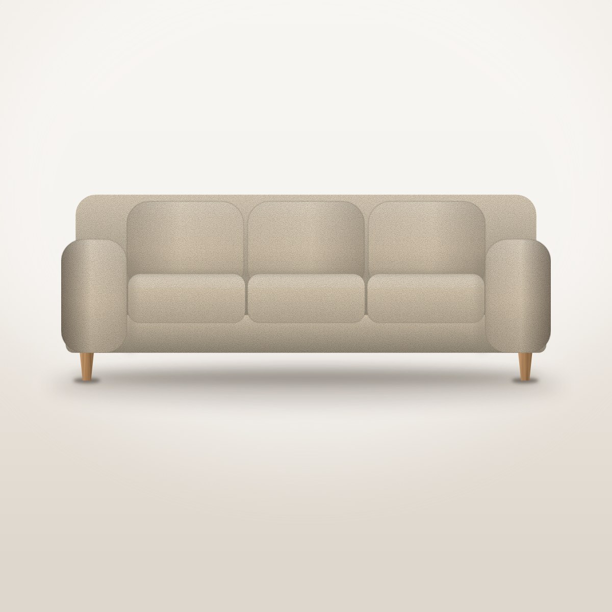


1 / 6
Complete the look, on the cart page
The Cart & Checkout Upsells add-on puts a product row on the shop’s own cart and checkout pages, so it cannot be shown on this page.
Put something in your basket, then open your cart: beneath your items, where WooCommerce would show its own suggestions, “Complete the look” offers the cushion, lamp, rug and vase with Add to cart buttons. The checkout shows the same row as “Add a finishing touch” just before the payment methods. While the basket is empty, neither row appears.
A scroll-driven story (Pro)
With Pro, the page’s own scroll can turn a slider’s slides: the slider pins itself to the top of the screen while you scroll through it, then lets the page carry on.
Walk through the rooms
Scroll down: the slider stays pinned to the top of the screen, and each stretch of scrolling fades in the next of six rooms, from the Harbour sofa to the Nest bed; scroll back up to walk back. Your scrolling decides the slide, so there are no arrows and dragging is off, and the dots only show where you are (scroll_drive, scroll_length). The story’s stage is five and a half screens tall, so keep scrolling to reach the next section.
From the template library
Any slider can start from one of 66 ready-made designs: 30 come with the free plugin and 36 with Pro. Each one below began as a template and then got Noyan Home pictures and words.
Spotlight (free template)
The free ‘Spotlight’ hero template: three slides built from stacked sections, each with a small heading, a headline and a button, most with a line of text too. We kept its layout and put in two room photographs, a Harbour sofa packshot and Noyan Home’s own words; it moves on every six seconds, or use the arrows and dots (autoplay_delay).
Lookbook (Pro template)
The Pro ‘Lookbook’ hero template: a row of three pictures (a row on a phone too), then a headline on its own, then words beside a room picture. We put four furniture pictures into its image frames and rewrote its fashion copy for furniture; the layout and colours are the template’s own.
Product carousel (free template)
The free ‘Product carousel’ template: square product cards, four across (two on a tablet, one on a phone), moving two at a time (slides_to_scroll). We only swapped in six furniture packshots with their names and links; drag the row, or click a card to open that piece.
Elementor sections (free template)
The free ‘Elementor sections’ template, whose slides each show a design saved in Elementor’s library (template_id); here they are the same Noyan Home room designs as in the Elementor slider further up. A slide’s own picture is not drawn over the design, it only feeds the thumbnail strip we switched on underneath (thumbnails): click one to jump to that room.
Bestsellers (Pro template)
The Pro ‘Bestsellers’ template comes with settings only, so we gave it a source: the shop’s furniture, best-selling first (orderby popularity), with live prices and Add to cart buttons (Select options for pieces that come in colours). Nothing has sold in this demo shop yet, so the six pieces are tied at zero sales and appear in no particular order.
Latest articles (Pro template)
The Pro ‘Latest articles’ template on its default source: the site’s newest blog posts that have a picture, three across with their category and title; the sample posts’ pictures are plain colour placeholders. These are the site’s sample travel, design and food posts, not furniture stories; click a card to read one.
Every template, on one page
The whole library on a page of its own: all 66 designs, free and Pro, each one a working slider.